So there I was. A fresh grad, straight out of design school. I land a job at one of the most cutting-edge design agencies in town. They're working on all kinds of cool stuff. On my first day they show me to my desk, which happens to be in an open-concept converted warehouse they call The Holodeck. An appropriate name, considering what's inside. On my way in I say hello to the resident robot, Kuri, one of their many completed projects. I pat it's head and it purrs. Seriously. To my right, there's a Lotus Elise being scanned in a photogrammetry rig. Behind, a full size transport truck they've built an Augmented Reality experience around. Someone's using the truck's cab as a meeting room to take a zoom call. Surrounded by geniuses and robotics on all sides, I look out at the walls, covered floor-to-ceiling with whiteboards. Scribbled on them in beautiful handwriting is the evidence documenting just about every cool thing they've ever worked on.
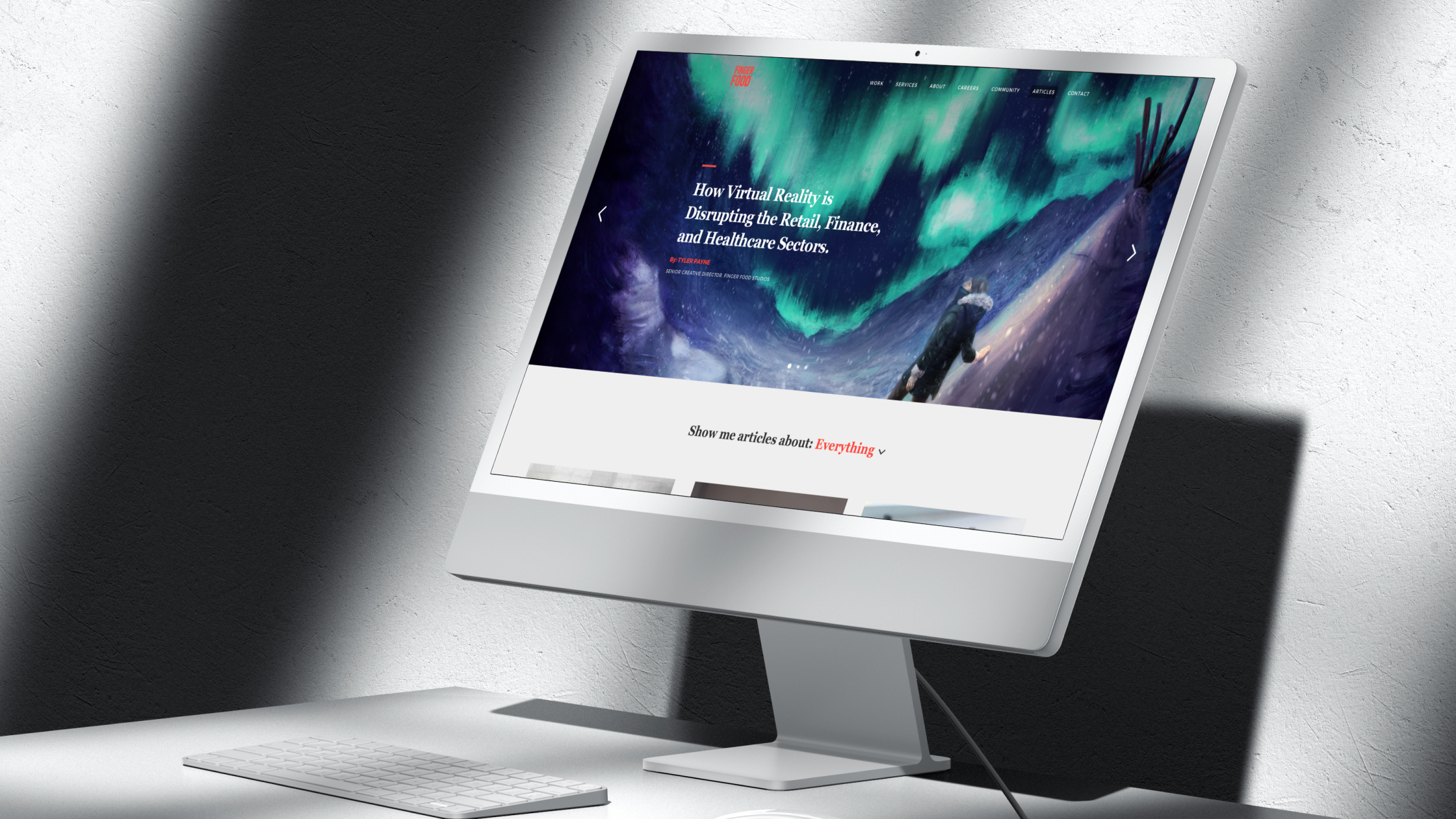
My creative director walks over and casually tells me I'm going to redesign the company website. All this awesome stuff needs to be properly seen. Oh boy.

Though the wireframes for this project have been lost to the sands of time (sacrificed to the Sketch gods), I can assure you, they were a-plenty. I spent weeks meeting with stakeholders, learning about the company, digging into their projects, about who they were, where they wanted to go, and the story they wanted to tell. Wires were framed, and iterated on until everybody all the way up the chain was happy with the direction things were going in. It was a tough balancing act, but by championing a content-first approach, I was able to filter out the most important information, and present it in a structured way that looked sleek and ultimately achieved business goals.
What I'm most proud about with this project was the opportunity it gave me to help the company kickstart a new visual direction and soft re-brand. Finger Food Studios was about to become Finger Food Advanced Technology Group, and starting with the home page gave me a chance to define a new, bold visual style that would do justice to all of the awesome work going on around me. To make this happen, I took a big risk. Not thinking that illustrations or still images would cut it to properly show off all the 3D work going on at the company, I felt that we needed to have 3D visuals showcased on the page. Only problem was I'd never used Blender. So... I learned Blender. Thankfully, I was able to put my thoughts to the page, and the resulting 3D renders led to a streamlined visual style for the company as showcased above.

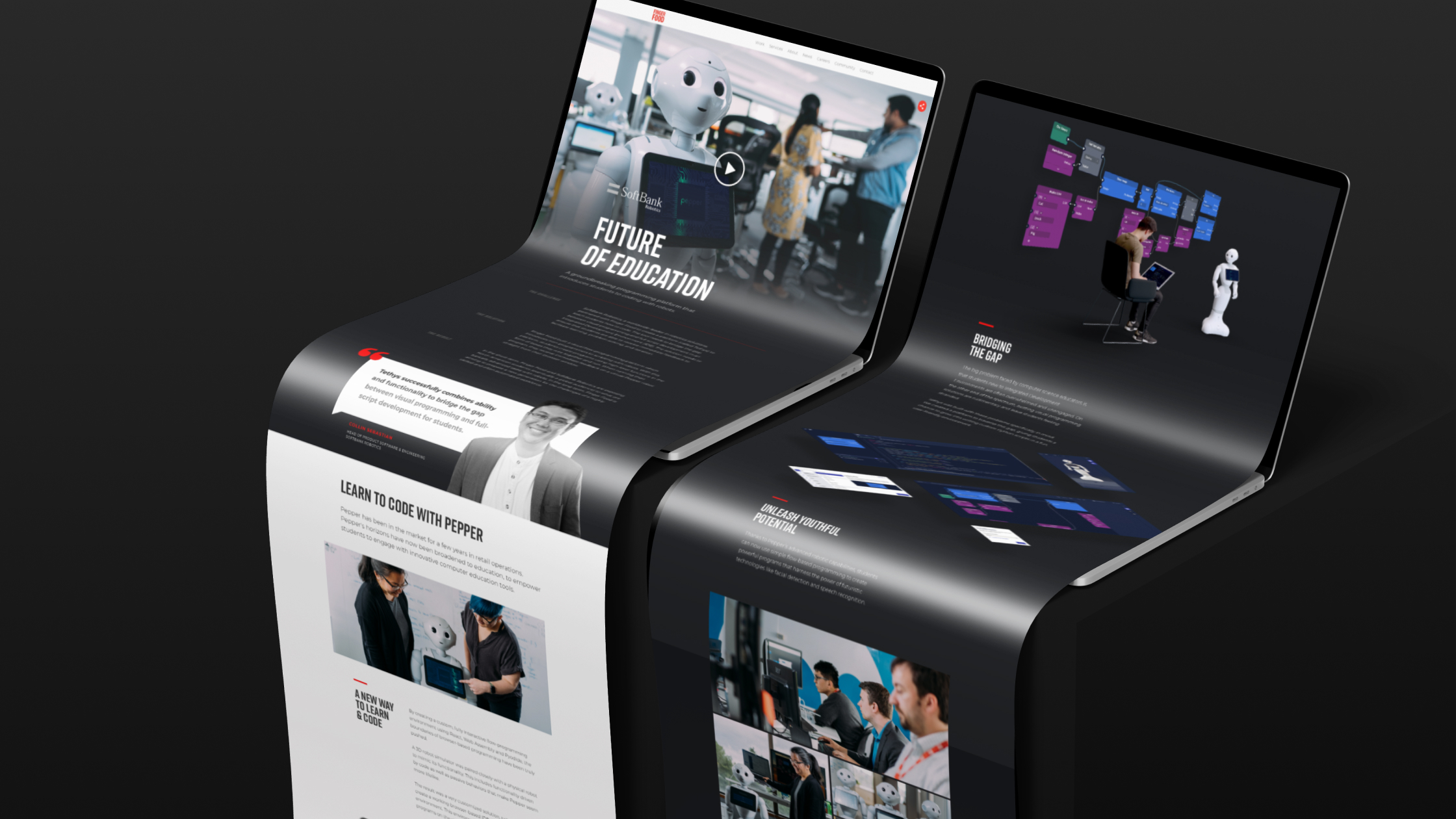
Okay, not everything was fun and games. Press Release Pages and Blog Posts and Contact Pages had to be done too. But pages like a Case Study for a project done with Softbank Robotics allowed me to get creative with layout, style, visual elements and animations. I used Blender to create visuals, After Effects to prototype animations, and my budding communication skills to work with the devs to get them implemented. The result was a page worthy of all the hard work put into the project itself.
On the technical side, I learned a lot about responsive web design. I taught myself Blender and buffed up my After Effects Skills. I learned how to take an idea from the whiteboard to the screen. Most importantly though, I learned about everything it takes to get a project done away from your desk. Working as part of a team with devs to get designs implemented, communicating with stakeholders to get the right ideas on the page, and doing it all within a high-pressure, fast-paced environment. I also think the end result was pretty rad.